
unknownPosters & Visuals
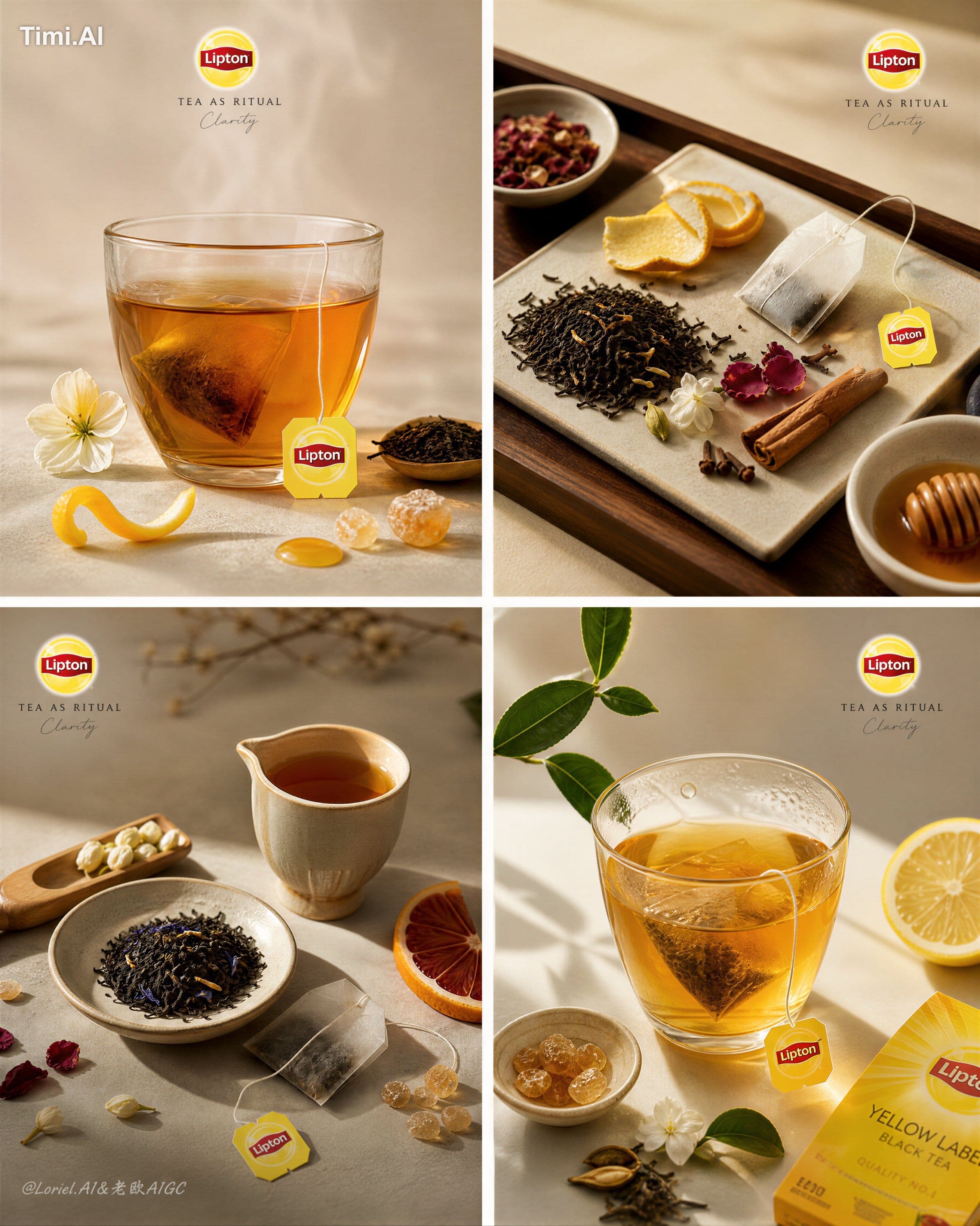
Create an ultra-premium vertical 4-panel campaign board for Lipton, preserving the same …
unknown prompt and image example

@ou_zhen599
View source post ↗👁 279♥ 14★ quality 100
PROMPTTranslation
Create an ultra-premium vertical 4-panel campaign board for Lipton, preserving the same refined 2x2 tea-ceremony editorial grid while pushing the main direction into a clearer, stronger, more recognizable Lipton brand expression. The final result must feel like a world-class international tea campaign page: calm, precise, premium, product-led, with a richer but still elegant display of brewing ingredients, and with Lipton’s product identity unmistakably present through the tea bag, tag, and official logo system.
The four panels must still express one unified brewing philosophy: tea as ritual, tea as clarity, tea as a refined daily ceremony. Show real brewed tea, loose tea leaves, elegant tea liquor, and a moderately expanded set of tea-related supporting ingredients. Do not make the image sparse to the point of weak storytelling, but also never overcrowd it. Every panel must feel curated and intentional. Lipton’s product identity must now be clearly readable at first glance through subtle but consistent brand anchors: tea bag presence, tag design, small logo placement, and packaging logic where appropriate.
Use a clean 2x2 composition with generous spacing between panels and strong breathing room inside each panel. The color palette should remain warm and premium, but now more distinctly aligned with Lipton’s brand language: amber tea gold, honey brown, pale citrus yellow, warm sand, muted cream, soft wood brown, and restrained touches of Lipton yellow-red brand recognition. The brand colors must remain subtle and elegant, never loud, but the overall campaign should now feel unmistakably Lipton rather than generic luxury tea.
Typography must remain light, thin, and editorial. Use only a very small English title, a tiny micro-line if needed, and an extremely restrained handwritten-style accent. However, the official Lipton logo must now be more clearly and consistently integrated across the four panels, in a small but visible way. In addition, the Lipton tea bag tag or a visible tea bag string should appear more intentionally in the compositions, functioning as a branded signature detail. The text system should still feel like an international design magazine whisper, but the product origin must now be unmistakable.
Tea vessels must remain restrained and expensive: thin-walled clear tea glass, low understated ceramic cup, shallow ceramic dish, bamboo scoop, minimal wood pedestal, elegant neutral tea tray. Keep vessels controlled and quiet so the brewed tea and Lipton cues remain dominant.
Panel 1, top-left:
A hero brewed Lipton tea in a simple clear glass cup or refined minimal vessel, placed with generous negative space around it. The tea glows with rich amber transparency. Nearby, show a curated but moderate ingredient set: loose black tea, a thin curl of citrus peel, one floral accent, and a subtle sweetening cue such as a honey drop or a few sugar crystals. Include a clearly visible Lipton tea bag tag or tea bag string placed elegantly so the product identity is immediately understood. The official Lipton logo may appear lightly above or near the composition in a premium editorial way.
Panel 2, top-right:
A more ingredient-led still life arranged on a minimalist tray or surface. Show real loose tea leaves and a slightly fuller range of supporting ingredients associated with brewed black tea: citrus peel, dried petals, spice fragments, honey or rock sugar logic, and one or two extra botanical details. Integrate the Lipton tea bag more clearly here, either resting within the mise-en-place or partially emerging from the tray area, with the branded tag visible. Add a small but crisp Lipton logo placement to reinforce the identity without breaking the calm mood.
Panel 3, bottom-left:
A second tea preparation still life with a different asymmetrical rhythm, like a tea master’s mise-en-place. Show a small vessel, one ceramic dish, loose tea, and several restrained supporting ingredients arranged with exact spacing. The Lipton tea bag and string should again appear in a tasteful, product-forward manner, perhaps partially resting near the vessel or lying beside the tea ingredients, making the brewing source explicit. This panel should feel slightly more product-aware than before while remaining elegant and controlled.
Panel 4, bottom-right:
A luminous brewed-tea scene with the strongest sense of freshness and quiet ritual. Show a clear golden tea in a simple glass vessel, accompanied by a leaf sprig, fruit slice, and a few relevant supporting ingredients placed with breathing room. Add a subtle but clear Lipton cue such as a branded tea bag tag, a tea bag immersed in the vessel, or a tiny pack-presence logic placed elegantly at the edge of the scene. The panel should still carry strong minimal poetry, but now clearly belong to a Lipton campaign.
Across all four panels, make the supporting ingredients slightly richer than before, but never let them compete with the tea. The image should communicate real brewing logic and flavor cues. Lipton identity must be clearer through repetition of key product signatures: yellow-red branded tag, tea bag presence, and discreet official logo placement. These should function as calm proof of brand, not loud decoration.
Push realism to the highest level: transparent tea liquor, believable loose-leaf texture, delicate citrus skin, floral petal detail, sugar crystal edges, honey gloss, wood grain, ceramic glaze, glass reflections, subtle meniscus, faint steam, tiny dust particles in light, and refined shadow falloff. Tea bag paper texture, string tension, and printed tag material must also feel completely real and premium.
Lighting must be exceptionally soft, natural, and controlled. Use refined tea-house lighting with warm gentle highlights, elegant ambient shadow, soft reflections on glass and ceramic, and a premium sense of stillness. The image should feel expensive because every object is chosen with restraint and placed with precision, while the Lipton brand identity now feels confidently and clearly present.
The final result must look like a collectible luxury tea campaign page: same 4-panel brewing structure, slightly richer ingredient presence, lighter typography, restrained vessels, but with clearer Lipton product identity through tea bag, tag, logo, and branded editorial continuity.
Avoid crowded ingredient piles, avoid loud branding, avoid heavy copy, avoid decorative clutter, avoid generic cafe styling, avoid over-staged tea sets, avoid noisy compositions, avoid cheap wellness aesthetics, avoid cartoon rendering.
Turn this look into your image
#Lipton#tea#campaign board#product advertisement#editorial grid#food and beverage#commercial photography
Related prompts

✨ View prompt♥ 1108
✨ View prompt♥ 1020
✨ View prompt♥ 99
✨ View prompt♥ 268

✨ View prompt♥ 78
✨ View prompt♥ 56
✨ View prompt♥ 179
✨ View prompt♥ 77
✨ View prompt♥ 90
✨ View prompt♥ 63
✨ View prompt♥ 84

✨ View prompt♥ 56