
unknownPosters & Visuals
When the screen is full of clean, sharp AI images, the ones that make you stop are those…
unknown prompt and image example

@VigoCreativeAI
View source post ↗👁 10,075♥ 112★ quality 88
PROMPTTranslation
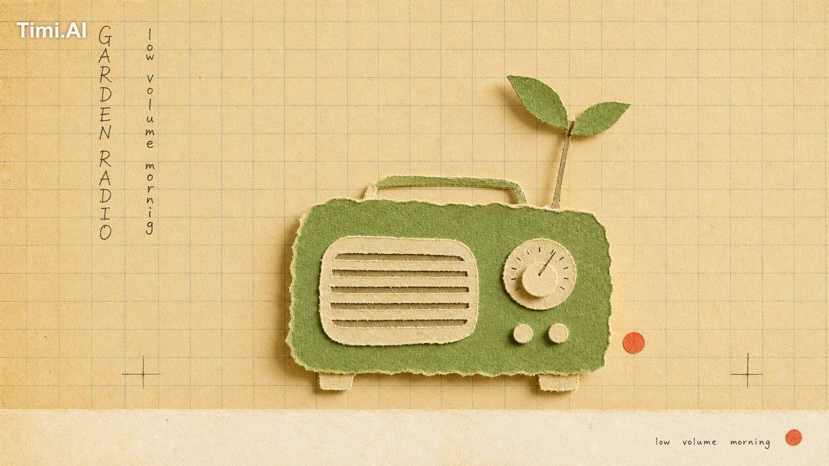
When the screen is full of clean, sharp AI images, the ones that make you stop are those that look like you can "touch them with your hands."
The frayed edges of torn paper, the grain of the paper, the yellowed grid notebook background—your eyes automatically assume "someone made this by hand," and the warmth immediately rises.
The best twist: this most "handmade, least digital" texture is precisely what AI produces. Texture is the switch that gives digital images a sense of human warmth again.
And these 4 images are from the same template: locked-in style (yellowed grid paper + torn paper collage objects + frayed paper texture + small typewriter labels + a small seal), only the "collaged objects" change. Copy the template and use it directly—
"Create a {ASPECT_RATIO} image in the \"school-grid-paper-cutout-poster\" visual style.
Subject: {SUBJECT}
Action: {SUBJECT_ACTION}
Prop/Product: {PRODUCT_OR_PROP}
Location: {LOCATION}
Background: {BACKGROUND_ELEMENTS}
Main text: {MAIN_TEXT}
Secondary text: {SECONDARY_TEXT}
Accent symbol: {ACCENT_SYMBOL}
Wardrobe/styling: {WARDROBE_STYLE}
Style fidelity anchors: {STYLE_FIDELITY_ANCHORS}
Source content to avoid: {SOURCE_CONTENT_TO_AVOID}
Apply these style rules:
- Composition: warm cream classroom grid paper background, straight-on copy-stand view, one oversized torn-paper collage object centered slightly right of the hand-written text block, generous empty grid space, and a narrow pale bottom margin.
- Typography: one compact vertical column or two slim vertical columns of loose hand-drawn notebook characters on the upper-left side, dark graphite or faded ink, uneven and human, never clean digital type.
- Color: mostly yellowed beige paper with muted blue-green grid lines, cream torn-paper layers, one saturated cut-paper accent color, and tiny dark handwritten marks.
- Texture and lighting: real paper grain, deckled torn fibers, slight scan softness, low contrast vintage print finish, soft diffuse overhead light, and shallow physical shadows under lifted paper edges.
- Graphic elements: ruled grid structure, torn paper silhouette, optional tiny generic seal-like mark, and a small bottom caption strip; keep all marks generic.
Avoid: no ice cream, no soft-serve shape, no cone silhouette, no fast-food branding, no recognizable logo, no original Chinese headline, no source watermark or signature, no dense scene, no glossy product render, no 3D object, no vector poster, no QR code.
Important content rule: match the reference style first, then change the source content. Use new subjects, new scene details, new props or products, and new text while preserving the style fidelity anchors
What does this yellowed grid notebook + hand-torn paper feel remind you of? Let's chat in the comments section."
Turn this look into your image
#torn paper collage#grid paper#vintage style#hand-drawn typography#craft texture#radio illustration#school notebook
Related prompts
✨ View prompt♥ 1108
✨ View prompt♥ 1020
✨ View prompt♥ 99
✨ View prompt♥ 268
✨ View prompt♥ 78
✨ View prompt♥ 56
✨ View prompt♥ 179
✨ View prompt♥ 77
✨ View prompt♥ 90
✨ View prompt♥ 63
✨ View prompt♥ 84
✨ View prompt♥ 56