
unknownPosters & Visuals
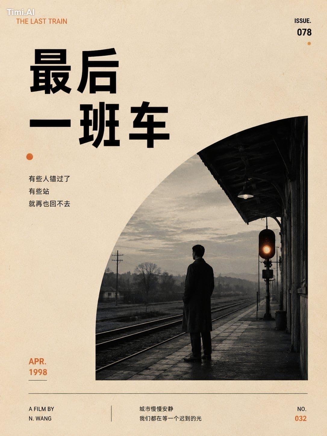
Truly high-end nostalgic movie posters are often not created by adding elements, but by …
unknown prompt and image example

@derek_wall90176
View source post ↗👁 4,201♥ 56★ quality 90
PROMPTTranslation
Truly high-end nostalgic movie posters are often not created by adding elements, but by subtracting them.
Remove redundant colors, remove complex scenes, remove explanatory elements, and finally leave only a small black-and-white image + one warm orange metaphor + a large amount of negative space.
The most charming aspect of this style is that it doesn't look like an advertisement; it looks more like an independent film poster you would want to collect, or an editorial cover torn from an old magazine.
🎯 Core Prompt (Copy and use directly)
Subject: [Fill in subject] Main Title: [Fill in title] Subtitle: [Fill in subtitle, can be left blank] Scene: [Fill in specific scene] Warm-colored symbol: [Fill in an orange/reddish-orange metaphorical element] Aspect Ratio: 3:4
Generate a minimalist, nostalgic, cinematic editorial poster.
Overall style leans towards independent film posters, old magazine covers, vintage printed posters, minimalist editorial design, and nostalgic cinematic feel.
Visual requirements: Use a warm off-white old paper background with slight film grain and vintage print textures; the overall look is clean and restrained.
Layout uses asymmetrical composition, retaining large areas of negative space; the atmosphere is quiet, restrained, detached, and emotionally evocative.
The main visual is a small black-and-white photographic scene featuring only one lonely figure or a small, emotionally resonant subject.
Incorporate one low-saturation warm-colored symbolic element into the black-and-white scene (e.g., orange sunset, old street lamp, station signal light, window light, amber phone booth light, orange scarf, rust-orange ticket stamp, warm orange light from a door crack, etc.).
Typography requirements: Use bold, sans-serif fonts for the main title, with a vintage magazine/old film publication/retro editorial design feel. The title should be clear and powerful, but not overwhelm the frame.
Small amounts of auxiliary information can be added: issue number, year, thin lines, small dots, color bars.
Overall color palette is restricted to: off-white, black, gray, and one warm orange accent.
Prohibited: excessive colors, high-saturation glare, commercial advertising feel, complex character movements, messy small text, templated AI posters, cheap cyberpunk style, excessive typography.
Final effect: Like a nostalgic, restrained, quiet, and slightly lonely independent film poster, possessing the editorial order and collectibility of a magazine cover.
💡 Core Logic
This style usually relies on only four things:
Negative space: Not just emptiness, but a place for emotions to pause.
Black-and-white scene: Automatically strips away noise, making the image feel more like a "memory."
One warm color: Orange is gentler than red and feels more like light in old movies (street lamps, sunsets, old light bulbs, station signals, vintage film color shifts).
Old print feel: Not about making it look dirty, but about the temporal grain of old publications, vintage posters, and old film.
Use the fewest elements to establish the strongest emotional association.
📌 One-sentence summary
The charm of a minimalist nostalgic cinematic poster lies not in making it look old, but in using a small piece of black-and-white memory, one warm orange metaphor, and plenty of negative space to slowly press emotion into the frame.
Turn this look into your image
#movie poster#minimalist#vintage#black and white#orange accent#train station#solitude#editorial design
Related prompts
✨ View prompt♥ 1108
✨ View prompt♥ 1020
✨ View prompt♥ 99
✨ View prompt♥ 268
✨ View prompt♥ 78
✨ View prompt♥ 56
✨ View prompt♥ 179
✨ View prompt♥ 77
✨ View prompt♥ 90
✨ View prompt♥ 63
✨ View prompt♥ 84
✨ View prompt♥ 56