
![请为品牌[品牌名称]、类目为[品牌类目]创作一张高审美、高完成度的「品牌包装系统展示图」。这不是普通电商白底图,也不是单](/_next/image?url=https%3A%2F%2Fpub-c63007d390234d64a94ea33acc7ed30e.r2.dev%2Fgpt-image%2FWHvPFmV3QDSOVlXL.jpg&w=3840&q=75)
GPT Image 2Ads & Product
Create a high-aesthetic, high-fidelity "Brand Packaging System Presentation" for [Brand …
GPT Image 2 prompt and image example

@MrLarus
View source post ↗👁 2,985♥ 33★ quality 55
PROMPTTranslation
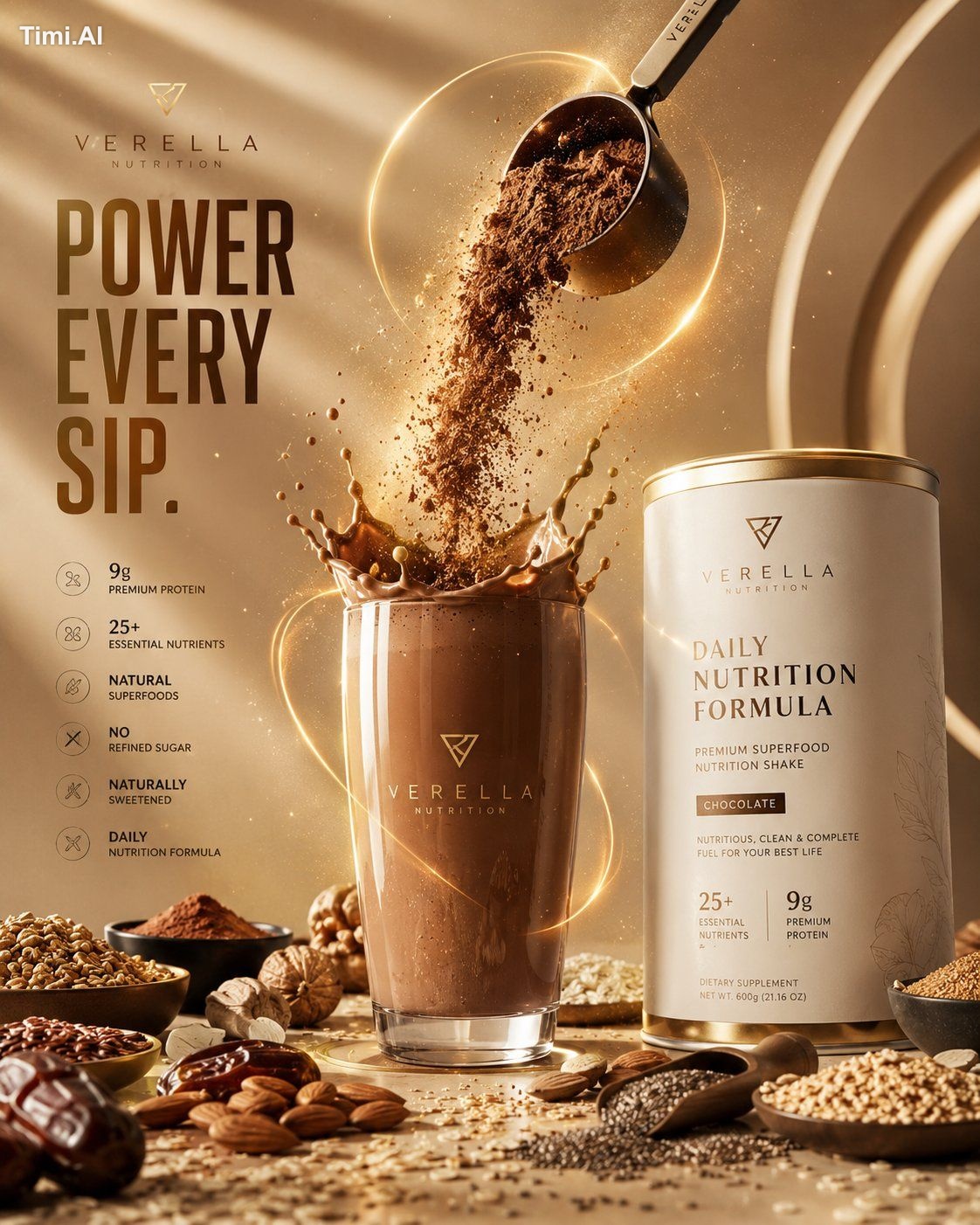
Create a high-aesthetic, high-fidelity "Brand Packaging System Presentation" for [Brand Name] in the [Brand Category]. This is not a standard e-commerce white-background image or a single product shot, but a professional packaging family display that conveys a sense of brand proposal, visual identity system, and commercial photography quality. The image must demonstrate "the unified implementation of the same brand across multiple packaging carriers," presenting a complete packaging system for a mature consumer brand.
【Aspect Ratio】 The overall composition must be a fixed 4:5 vertical poster format. Landscape orientations, wide desktop displays, or overly scattered horizontal arrangements are prohibited. The composition must follow poster reading logic: reserve breathing space at the top, place the main visual focus of the packaging system in the center, and arrange auxiliary packaging, labels, and the actual product at the bottom. The overall center of gravity should be focused, suitable for direct publication as a brand display poster.
【Core Requirements】 Automatically match the most reasonable and natural packaging combinations and product forms based on the [Category], and establish a unified brand visual system around [Brand Name]. Select a small but representative set of packaging forms to create a complete and refined brand system. Focus on hierarchy, brand consistency, and display aesthetics rather than quantity. Select a subset of the following based on the category: tote bags/shopping bags, paper boxes/gift boxes/outer cartons, long boxes/single-item boxes/set boxes, pouches/envelopes/sample sachets/soft bags, cups/bottles/jars/tubes/spray bottles/pump bottles, labels/stickers/seals/tags/cards, and the actual product corresponding to the category.
【Category Adaptation Logic】 Packaging forms and product shapes must be adapted to the [Category]. Examples: For food/bakery/snacks/beverages, focus on paper bags, boxes, pouches, cups, food containers, stickers, and seals. For tea/coffee/drinks, focus on cups, bottles, cans, carriers, sleeves, and gift boxes. For beauty/skincare/cosmetics/perfume, focus on bottles, jars, tubes, boxes, gift boxes, and sample packaging. For fragrance/home/lifestyle, focus on diffuser bottles, candle jars, boxes, and tags. For apparel/accessories/toys/stationery, focus on drawer boxes, dust bags, totes, and tags. For digital accessories/tools, focus on hard boxes, storage pouches, instruction cards, and labels. The result must reflect "category-appropriate, brand-unified, and systematic" packaging.
【Quantity and Density Control】 Control the number of objects; do not overcrowd. Present a "less is more, complete but not cluttered" effect. Recommended: 1–2 large packages, 2–3 medium packages, 2–4 small packages or auxiliary items, and 1–3 actual products, totaling 6–10 visible elements. Ensure sufficient white space and breathing room so that each item is clearly visible, well-spaced, and organized.
【Brand Visual System Requirements】 All packaging must belong to the same brand system, using [Brand Name] as the core identifier. Maintain consistency in logo presentation, typography, graphic language, illustration style, pattern system, layout logic, color palette, and material/printing textures. The brand tone, color direction, and visual atmosphere should be automatically matched to the [Category]. The style should be unified, coordinated, and recognizable—whether minimalist, organic, modern, luxury, fresh, artistic, or classic—reflecting the design maturity of a professional brand.
【Color Mechanism】 Avoid fixed color combinations or repetitive palettes. Actively form distinct primary color schemes based on the [Category] and brand temperament using "controlled divergence." Colors can be low-saturation natural tones, modern neutrals, light retro, bright and fresh, luxury darks, or artistic palettes. Maintain a high-end, restrained, and branded feel. Avoid neon colors, cheap high-saturation tones, or chaotic multi-color collages.
【Composition and Display】 Use a brand family display logic rather than a chaotic pile. Use a commercial studio setting with a 3/4 high-angle or slightly perspective-corrected front-facing view to create an orderly, hierarchical display. Logic: Place 1–2 larger packages in the background as visual support; arrange core or hero products in the mid-ground; place smaller items, labels, and actual products in the foreground. At least one actual product should interact naturally with the packaging. Create a balanced, triangular, or staggered composition.
【Visual Style】 Present a high-end commercial photography texture. The background should be a clean studio environment (white, warm white, light gray, or a minimalist background matched to the brand tone). Emphasize realistic material properties: paper creases, box structures, bottle contours, label details, printing textures, embossing, foil stamping, matte finishes, or tissue/kraft paper textures.
【Lighting】 Use professional commercial studio lighting, either soft diffused light or subtle directional natural side light. Include clear but restrained shadows to enhance three-dimensionality, spatial depth, and a premium feel. The light should be translucent, bright, and clean. Avoid dark, cheap, or cluttered backgrounds.
【Final Effect】 The final image should look like a professional brand packaging system poster, a packaging family proposal, or a brand visual implementation render, not a scattered product collage. Key focus: 4:5 vertical poster format, brand unity, packaging family integrity, commercial photography quality, design proposal feel, category adaptation, and high-end aesthetic completion.
Turn this look into your image
#luxury#minimalist#elegant#packaging#beauty
Related prompts
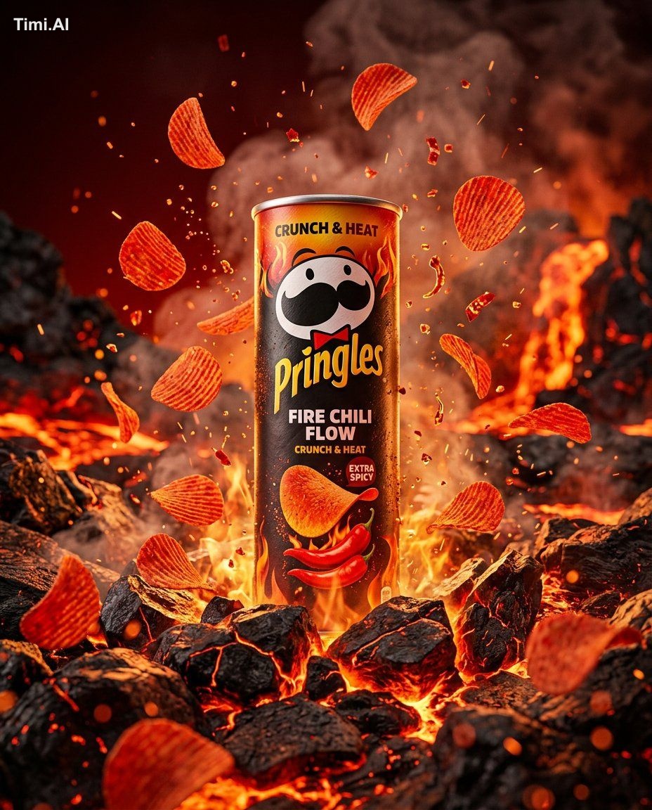
✨ View prompt♥ 110
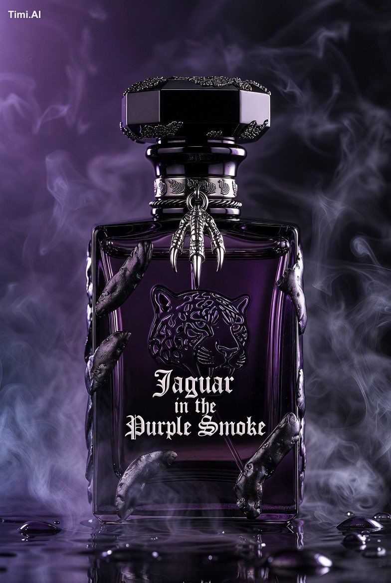
✨ View prompt♥ 64
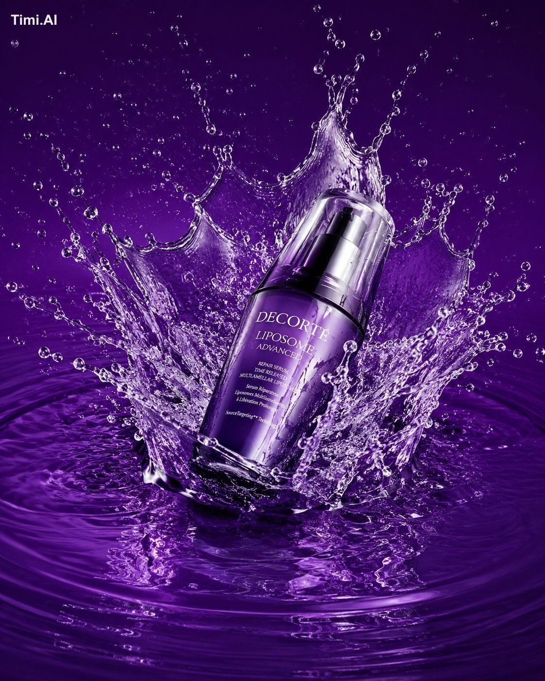
✨ View prompt♥ 112
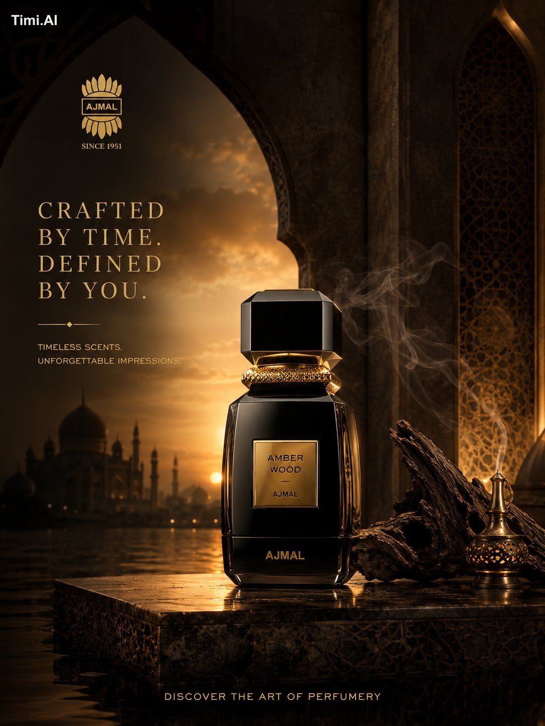
✨ View prompt♥ 115
✨ View prompt♥ 15
✨ View prompt♥ 17
✨ View prompt♥ 10
✨ View prompt♥ 6
✨ View prompt♥ 3
✨ View prompt♥ 1
✨ View prompt♥ 2731
✨ View prompt♥ 819