
GPT Image 2Posters & Visuals
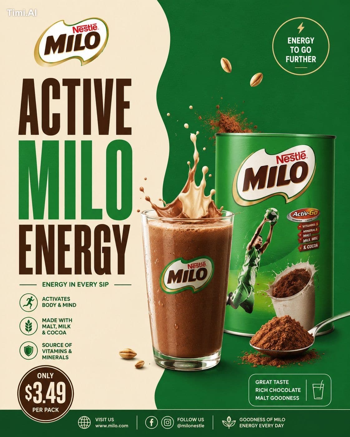
“MINIMAL DESIGN. PREMIUM COCOA ENERGY.” Create a premium minimalist FMCG poster for a [B…
GPT Image 2 prompt and image example

@jey_jey_Japa
View source post ↗👁 24,535♥ 352★ quality 90
PROMPTTranslation
“MINIMAL DESIGN. PREMIUM COCOA ENERGY.”
Create a premium minimalist FMCG poster for a [BRAND NAME] cocoa beverage inspired by retro-modern supermarket beverage ads, clean split-layout café posters, and modern FMCG commercial print campaigns.The poster should strongly resemble a minimal commercial advertisement with bold typography, smooth split-background composition, premium beverage styling, and clean editorial spacing.The design should feel:warm, creamy, cozy, modern, graphic, premium, commercial, organized, minimal, and visually pleasing.Avoid:
— cinematic realism
— chaotic splash explosions
— cluttered floating ingredients
— glossy 3D overload
— busy café environments
— luxury black-and-gold overload
— dark moody aesthetics
— excessive particles or effectsThe final result should resemble:a modern illustrated FMCG cocoa beverage campaign poster.CORE LAYOUT STYLE
Create a vertical 4:5 poster with:— smooth split-background composition
— oversized stacked typography
— centered hero cocoa drink
— minimal floating ingredients
— clean promotional UI blocks
— geometric spacing
— strong negative space
— balanced commercial hierarchyThe layout should feel:minimal, clean, bold, organized, and premium.MOST IMPORTANT FEATURE — SPLIT BACKGROUND SYSTEM
Create a smooth organic TWO-TONE split background inspired by modern café posters.LEFT SIDE
Use lighter tones such as:— cream
— warm beige
— vanilla
— milk tones
— soft ivoryRIGHT SIDE
Use darker brand-supporting cocoa tones such as:— chocolate brown
— mocha
— cocoa tones
— caramel brown
— deep brand color accentsThe split curve should feel:smooth, fluid, elegant, soft, and modern.Use only:
— subtle gradients
— soft shadows
— faint glow accentsAvoid:
— dramatic textures
— smoke overload
— cinematic lighting
— heavy depth-of-field blurThe background should remain:flat, clean, airy, and commercially polished.TYPOGRAPHY (MOST IMPORTANT)
Use HUGE ultra-bold condensed sans-serif typography occupying 40–50% of the composition.Font inspiration:
— Bebas Neue
— Anton
— Oswald Bold
— Druk Condensed
— League GothicTypography should feel:bold, retro-modern, commercial, premium, and FMCG-focused.HEADLINE EXAMPLES
“PURE
COCOA
COMFORT”“RICH
CHOCOLATE
ENERGY”“WARM
EVERY
SIP”“CREAMY
COCOA
MOMENTS”“SMOOTH
HOT
CHOCOLATE”Typography styling:
— tight spacing
— strong vertical stacking
— clean alignment
— minimal captions
— thin divider lines
— simple white or cream textAvoid:
— decorative fonts
— handwritten typography
— playful bubble fonts
— luxury serif overloadHERO DRINK COMPOSITION
Create a semi-realistic cocoa beverage with minimalist commercial styling.Possible setups:
— transparent glass mug
— ceramic cocoa cup
— iced cocoa glass
— creamy hot chocolate drink
— chocolate milkshake style beverageInclude:
— rich creamy cocoa texture
— smooth milk splash arcs
— glossy highlights
— subtle steam curves
— chocolate swirl motion
— clean liquid reflectionsThe rendering should resemble:premium vector-commercial FMCG artwork.NOT cinematic realism.FLOATING ELEMENTS
Add only a FEW controlled floating elements.Examples:
— cocoa powder
— chocolate chunks
— milk droplets
— soft splash curves
— marshmallows
— cocoa spoon
— subtle steam ribbonsKeep everything:
organized, intentional, balanced, and minimal.Avoid chaotic particle explosions.PRODUCT PACKAGING
Include realistic [BRAND NAME] cocoa packaging naturally integrated into the composition.Packaging should:
— maintain the brand’s recognizable colors
— feel clean and slightly glossy
— resemble real supermarket packaging
— remain secondary to the hero drinkPlacement ideas:
— lower foreground
— beside the cup
— slightly overlapping typography
— integrated subtly into splash motionDo not overpower the layout.PROMOTIONAL UI ELEMENTS
Include minimal poster-style UI elements such as:— circular promo badge
— outlined price box
— small cocoa icon
— thin divider lines
— clean footer strip
— minimal benefit iconsDesign style:
— flat graphic styling
— white outlines
— compact typography
— minimal clutter
— editorial spacing
LIGHTING
Use soft commercial studio lighting with:—
smooth highlights
— soft reflections
— minimal shadows
— flat premium rendering
— clean beverage shineAvoid:
— dramatic cinematic contrast
— moody shadows
— heavy atmospheric lightingThe lighting should resemble:
modern FMCG print advertising.
COLOR SYSTEM
Use only 3–4 dominant colors.
UNIVERSAL BASE
— cream / ivory
— chocolate brown
— cocoa tones
— whiteADD BRAND COLOR ACCENTS
Examples:
— Cadbury purple
— Nesquik yellow
— Milo green
— Swiss Miss blue
— Galaxy caramel brown
Colors should feel:
coordinated, warm, commercial, minimal, and print-ad ready.
COMPOSITION RULES
Layer Order:Split background
Oversized typography
Cocoa splash motion
Hero beverage
Floating ingredients
Product packaging
Promotional UI blocks
Footer strip
Everything should feel:
balanced, minimal, premium, clean, and visually easy to read.Avoid visual overload.
FINAL VISUAL STYLE
The final poster should look like:— modern FMCG print advertising
— minimalist supermarket beverage campaigns
— retro-modern café posters
— commercial vector-realism hybrid artwork
— Instagram-ready commercial designNOT cinematic luxury advertising.
FINAL QUALITY
Minimal premium FMCG cocoa poster aesthetic.
Split-layout commercial composition.
Huge condensed typography.
Semi-realistic vector-commercial rendering.
Controlled floating elements.
Clean editorial spacing.
High-detail commercial rendering.
Ultra-clean poster realism.Aspect Ratio: 4:5
Ultra HD
8K
Instagram-ready FMCG campaign quality
Turn this look into your image
#poster#fmcg#beverage#cocoa#milo#advertising#minimalist#graphic design
Related prompts
✨ View prompt♥ 1108
✨ View prompt♥ 1020
✨ View prompt♥ 268
✨ View prompt♥ 56
✨ View prompt♥ 179
✨ View prompt♥ 63
✨ View prompt♥ 84
✨ View prompt♥ 56
✨ View prompt♥ 30
✨ View prompt♥ 38
✨ View prompt♥ 55
✨ View prompt♥ 15