
GPT Image 2Posters & Visuals
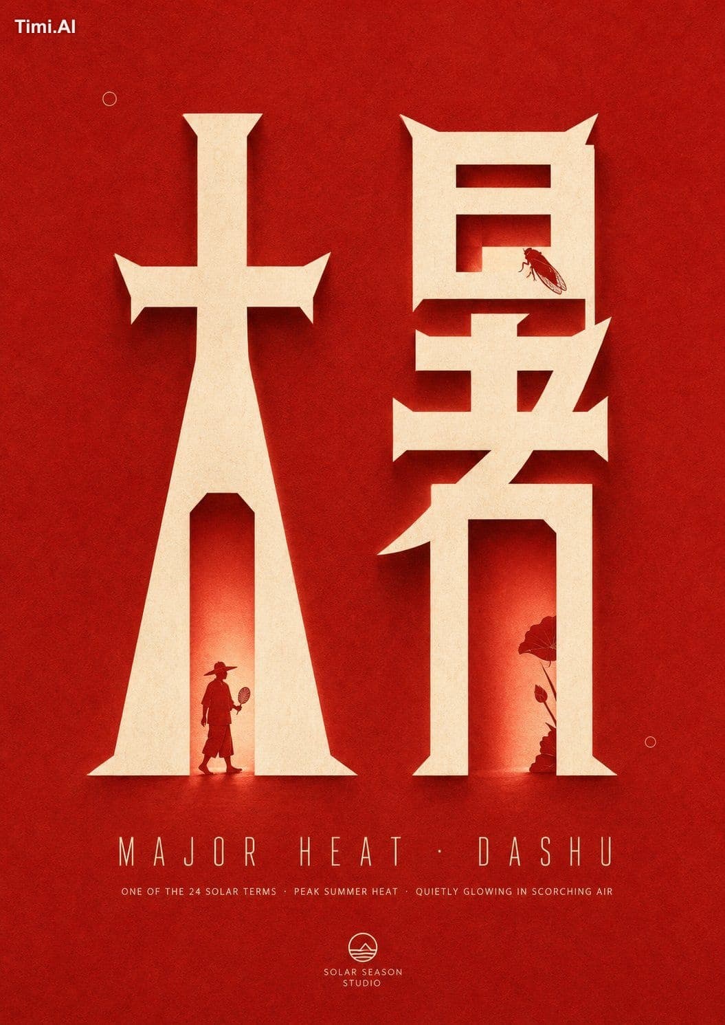
Establish a brand poster system centered on giant glyphs as the primary visual, building…
GPT Image 2 prompt and image example

@xiaoxiaodong01
View source post ↗👁 1,993♥ 16★ quality 84
PROMPTTranslation
Establish a brand poster system centered on giant glyphs as the primary visual, building around any specific theme. Extract a few core characters, numbers, or symbols from the theme's semantics and transform them into tall, narrow, monumental portal-like structures: strokes feature strong vertical stretching, thick upright stems, sharp beveled wedge tops, and horizontal bases that flare slightly outward. The glyph faces are presented in large areas of solid light color, with openings left inside to be intruded upon by narrative elements. When two or more glyphs are placed side-by-side, maintain wide spacing and a stable baseline, making them instantly recognizable as both architectural entrances and glowing cutouts; avoid simply enlarging standard fonts, rounded or weak stroke skeletons, or arbitrary distortion.
Concentrate visual weight in the upper-middle section of the frame. The giant glyphs occupy the primary height while leaving ample solid-color breathing room around them, with deep, quiet white space at the top. The glyphs are roughly balanced left-to-right but not mechanically symmetrical. In the lower-middle section, place one line of wide-tracked identification text followed by one line of lightweight descriptive text. At the very bottom, use a small-scale logo as a long-distance anchor point, allowing the eye to travel vertically from "large glyph—sparse name—descriptive info—bottom signature." Use clear gaps between paragraphs to create solemn pauses, avoiding equal partitioning, edge-aligned information, or template-like centered stacking.
Embed miniature narrative silhouettes derived from the theme into the lower sections and inner edges of the giant glyphs. These exist as solid silhouettes in the same color as the background, with details compressed into readable heads, limbs, appendages, or thematic actions. Partially cut into the light-colored glyph face to form negative space; one silhouette should be relatively complete and near the base, while another shows only edge fragments or is partially obscured by strokes, creating a sense of "passing through, peeking out, or entering the door" through asymmetrical placement. Configure a very small number of dot-like micro-markers to balance the voids.
The overall surface should have the physical feel of matte printing paper with slight screen-printing registration. The background is not a uniform color block but features fine paper fibers, low-frequency cloud-like tonal drifts, and soft grain. The giant light-colored glyphs resemble thick paper cutouts or backlit flat door frames, maintaining clear, hard edges. The inner sides and one exterior side cast wide, soft, monochromatic diffused shadows and faint glows; light is absorbed by the paper surface and spreads slowly, avoiding plastic highlights, metallic reflections, 3D bevels, or dirty distressing.
Use high-saturation warm red to occupy over 80% of the visual territory, with hues derived from thick pigment absorption and overprinting on paper. Dark areas should only feature subtle deep red undulations. The core glyphs, main name, descriptions, and logo uniformly use warm ivory white as structural light, restrained in area but creating the highest brightness jump. Embedded silhouettes return to the background red, making figures or thematic subjects appear as if carved out of the light-colored door body. Shadows maintain soft transitions within the red family without introducing distracting cool colors. If the theme requires a change in primary color, the role ratio must be preserved: a single high-saturation base color occupying the absolute majority of the area, warm light colors establishing the portal structure, same-color negative space handling the narrative, and same-tone shadows connecting material and light.
Auxiliary text should maintain low interference and precise order. Use narrow uppercase or equivalent tall-boned fonts for the thematic identification name, featuring outlines or light thin strokes, extremely wide letter spacing, and a neat baseline, making characters look like evenly spaced road signs rather than heavy subtitles. The next layer of description uses light, thin sans-serif, normal readable letter spacing, and a smaller font size. The bottom signature uses simplified graphic marks combined with compact text.
Turn this look into your image
#gpt-image#solar term#chinese culture#poster design#typography#minimalist#red#paper texture#illustration
Related prompts
✨ View prompt♥ 1108
✨ View prompt♥ 1020
✨ View prompt♥ 99
✨ View prompt♥ 268
✨ View prompt♥ 78
✨ View prompt♥ 56
✨ View prompt♥ 179
✨ View prompt♥ 77
✨ View prompt♥ 90
✨ View prompt♥ 63
✨ View prompt♥ 84
✨ View prompt♥ 56