
GPT Image 2Brand & Logo
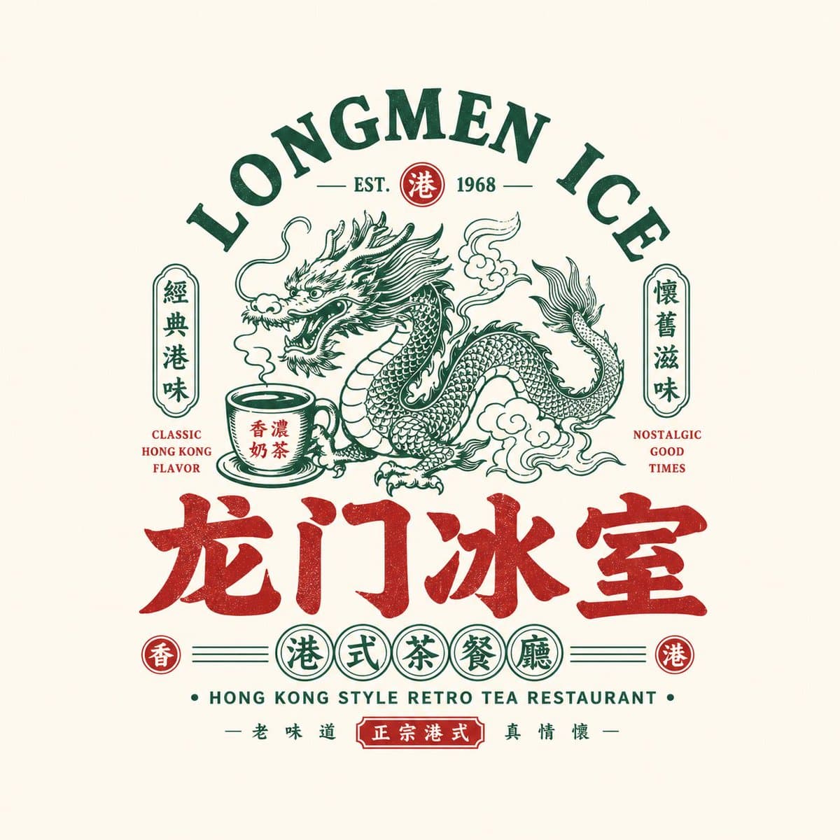
Please design a high-completion "Chinese Retro Food Emblem Logo" based on the user's inp…
GPT Image 2 prompt and image example

@MrLarus
View source post ↗👁 1,404♥ 20★ quality 55
PROMPTTranslation
Please design a high-completion "Chinese Retro Food Emblem Logo" based on the user's input: [Brand Name / Project Name], [Subtitle / Product Name], [Type / Industry], [Regional Flavor], [Brand Positioning], [Core Keywords], [Core Graphic], [Core Food / Category Element], [Emotional Vibe], [Primary Color], [Secondary Color], and [Aspect Ratio].
**[Core Objective]**
Design a "Chinese Retro Food Emblem Logo" that is truly ready for a catering brand. This is not a poster, a simple cartoon illustration, or just a few words. Using the Chinese main logotype as the core, integrate strong recognizable graphics, catering category symbols, retro Chinese-English typography, and a complete emblem structure to create a catering logo with a storefront presence, packaging appeal, brand system consistency, and high communicability.
The final result should immediately convey:
1. This is a catering brand;
2. It has a clear category and personality;
3. It functions as a mature brand master logo, not a decorative pattern.
**[Design Essence]**
The core of this logo is the integration of five layers:
1. Chinese Main Logotype: Responsible for brand recognition;
2. Graphic Symbol: Responsible for memory points and category association;
3. Emblem Structure: Responsible for overall integrity;
4. Chinese-English Typography: Responsible for layering and retro brand atmosphere;
5. Color System: Responsible for reinforcing catering tonality and category emotion.
**[Most Important Principles]**
1. The Chinese brand name must be eye-catching, clear, and have a "signboard" feel;
2. The logo must be a complete identifier, not a collage of scattered elements;
3. The graphic must be relevant to the brand name or category;
4. English is secondary; Chinese is primary; English must not overshadow Chinese;
5. The overall design must have catering brand attributes, suitable for storefronts, menus, packaging, and social media avatars;
6. The image must have a retro feel, but not look old, dirty, or lose modern brand completion;
7. It must have the flavor of a "Chinese Retro Food Emblem," not American cartoons or Japanese shop lettering.
**[Chinese Main Logotype Requirements]**
1. The Chinese brand name is the absolute protagonist;
2. The font should have a retro catering signboard feel, old packaging feel, or "Guochao" (national trend) title feel;
3. It can be heavy, bold, or use Gothic / Song-Gothic / commercial handwritten styles;
4. It can be moderately modified but must remain clearly legible;
5. Avoid minimalist thin fonts; avoid weak or generic system fonts;
6. Must possess a storefront presence and brand identity feel.
**[Graphic System Requirements]**
Design a highly relevant main graphic based on [Core Graphic] and [Category Element].
Options include:
- Animals / Mythical Creatures: Dragon, Phoenix, Tiger, Ox, Goose, Fish, Frog, Crane, etc.;
- Ingredients / Dishes: Lobster, Roast Goose, Beef, Noodle Bowl, Flame, Tea Cup, etc.;
- Traditional Totems: Seals, Patterns, Plaques, Auspicious motifs;
- Utensils / Scene Symbols: Grill, Flame, Bowl and Chopsticks, Ice Room elements, etc.
Graphic requirements:
1. Must have a memory point;
2. Must have a clear relationship with the category and name;
3. Do not make it too complex or realistic;
4. Must be suitable for integration into an emblem with the logotype;
5. Can lean towards retro illustration, woodcut feel, old trademark feel, or Guochao line art.
**[Emblem Structure Requirements]**
Design the overall layout as a complete "Catering Brand Emblem Logo," not a simple horizontal arrangement.
Structure references:
1. Top English arch + Central graphic + Bottom Chinese main logotype;
2. Central large graphic + Left/Right small labels + Bottom subtitle;
3. Circular / Oval / Plaque-style composition;
4. Central main image + Top/Bottom layered text;
5. Symmetrical layout + Small stamps + Small circular labels;
6. Old signboard / Old trademark / Packaging master label layout.
**[Chinese-English Typography Requirements]**
1. Chinese is primary, English is secondary;
2. English can be used for arched main titles, category names, store type descriptions, slogans, years, ESTD, etc.;
3. English participates in the composition to enhance the retro trademark feel;
4. English does not need to be excessive, but must be exquisite, clear, and serve the overall structure;
5. Use terms like: HOUSE, TAVERN, BARBECUE, ROAST GOOSE, TEA RESTAURANT, LOBSTER HOUSE, ESTD / SINCE / CLASSIC / SPECIALTY;
6. Do not let English overpower Chinese, and do not make it a purely English brand.
**[Auxiliary Element Requirements]**
Small elements to enhance the brand system feel can be added, such as:
- ESTD year, small circular stamps, small icons, small labels, small seals, regional descriptions, category descriptions, horizontal lines / dot matrices / small borders / slogan text.
Must be restrained; do not turn the image into a complex poster.
**[Color Requirements]**
Choose a suitable Guochao retro catering color system based on the category:
1. Black + Red: Barbecue, braised dishes, roasted meats, bistro;
2. Black + Gold / Brown-Gold: Old-established brands, deli, roast goose, Cantonese catering;
3. Green + Red + Cream White: Hong Kong-style ice room, tea restaurant;
4. Blue + Red + White: Seafood, lobster, young night-snack catering;
5. Black + Blue: Younger, more rational night snacks or taverns;
6. Red + Cream White: Old Changsha noodles, traditional snacks, etc.
Requirements:
- Colors must have a catering signboard feel;
- Do not use too many colors; 2-4 primary colors are most stable;
- High-saturation accents can enhance eye-catching appeal, but must maintain consistency.
**[Visual Presentation Requirements]**
1. This is an independent logo display, not a menu poster;
2. Background should be simple: light gray-white, cream white, paper white, or pure light base;
3. Logo body must be complete, clear, and centered;
4. Structure must be complete with layered information;
5. The overall look should be a mature catering brand master logo proposal.
**[Style Keywords]**
Chinese Retro Food Emblem Logo, Catering Brand, Retro Trademark, Old Signboard, Brand Emblem, Chinese-English Mixed Typography, Guochao Logotype, Catering Master Logo, Storefront Presence, Packaging Feel, Old-established Brand Feel, New Consumption Catering.
**[Acceptance Criteria]**
Ensure the final result:
1. Is immediately recognizable as a catering brand;
2. Has a prominent and legible Chinese main logotype;
3. Has a clear relationship between the graphic and the brand name/category;
4. Has a complete emblem structure;
5. Has layered Chinese-English typography;
6. Has a color scheme with catering brand temperament;
7. Is suitable for storefronts, menus, packaging, stickers, delivery avatars, and social media main images;
8. Has a mature commercial feel of a "Chinese Retro Food Emblem."
**[Output Requirements]**
Output a high-completion "Chinese Retro Food Emblem Logo." It must take the Chinese brand name as the core, combined with retro graphics, Chinese-English auxiliary systems, emblem-style composition, and clear category attributes to form a truly brandable, communicable, and implementable catering brand identity.
Turn this look into your image
#brand#logo#identity
Related prompts
✨ View prompt♥ 6
✨ View prompt♥ 2
✨ View prompt♥ 3203
![Create ONE final image.
A clean 3×3 [ratio] storyboard gri](https://pub-c63007d390234d64a94ea33acc7ed30e.r2.dev/nano-banana/uMwpNCHkUsaxCppS9DDpW.jpg)
✨ View prompt♥ 5072
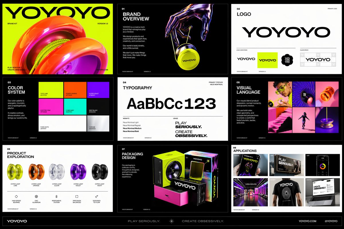
✨ View prompt♥ 539
✨ View prompt♥ 1756
![3D embossed glossy contour render of center-aligned [BRAND]](https://pub-c63007d390234d64a94ea33acc7ed30e.r2.dev/nano-banana/Zgt0xjTLx8ruLMYh.jpg)
✨ View prompt♥ 1759
✨ View prompt♥ 1495
![Based on [TOPIC], create a high-quality vertical “encycloped](https://pub-c63007d390234d64a94ea33acc7ed30e.r2.dev/gpt-image/g8oNrgm6ullAm93G.jpg)
✨ View prompt♥ 1589
![[INPUT IMAGE: USER_PHOTO] Use the person in the input image](https://pub-c63007d390234d64a94ea33acc7ed30e.r2.dev/gpt-image/_tgH3w8ykw-6TjttdRI0r.jpg)
✨ View prompt♥ 894
✨ View prompt♥ 435
✨ View prompt♥ 608