
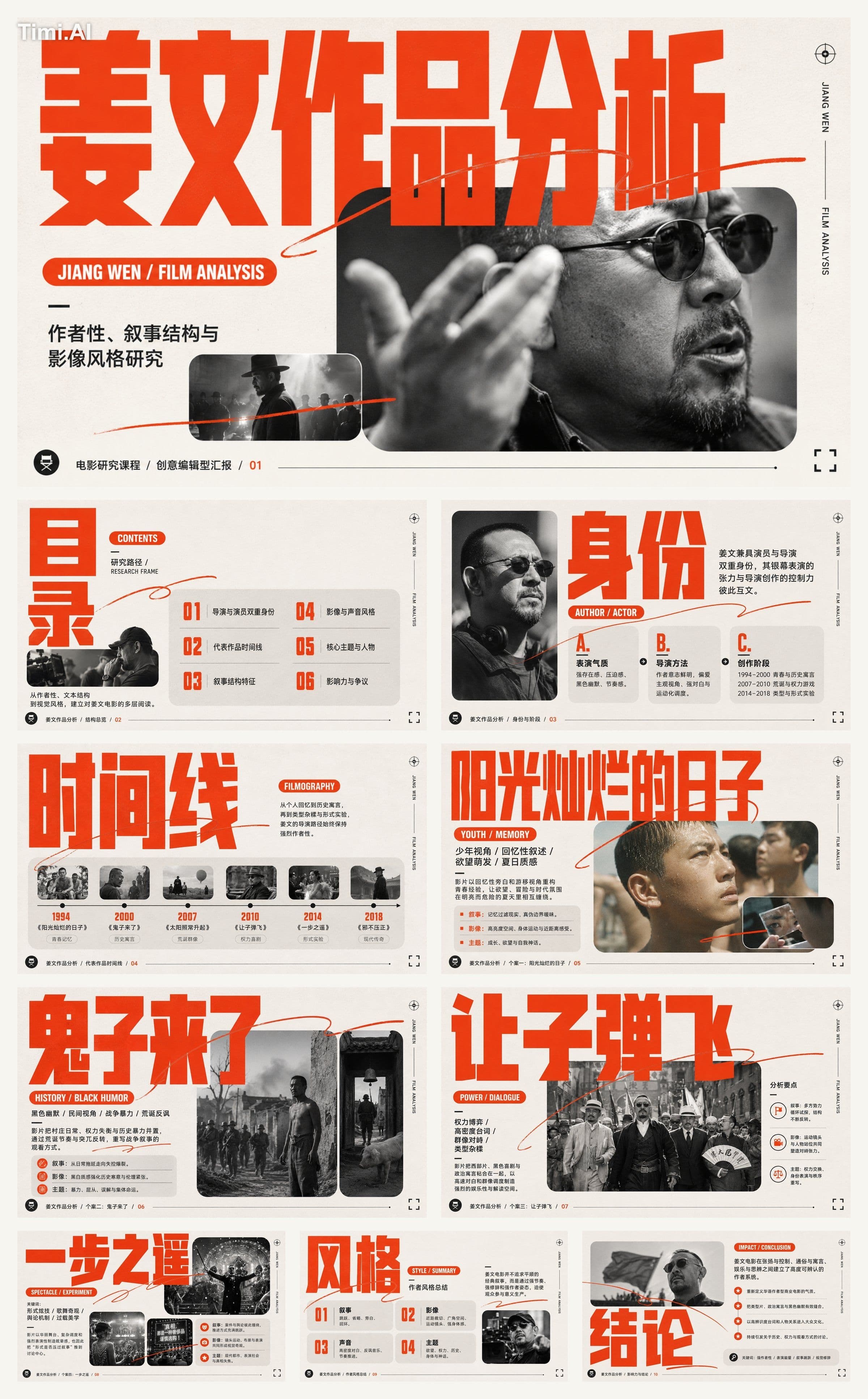
GPT Image 2Infographic
@Create images Create a creative editorial PPT based on an oversized, ultra-narrow headl…
GPT Image 2 prompt and image example

@xiaoxiaodong01
View source post ↗👁 3,093♥ 49★ quality 90
PROMPTTranslation
@Create images Create a creative editorial PPT based on an oversized, ultra-narrow headline pressing down on rounded image modules: Use functional asymmetry from new typography theory to create headline scale transitions and active white space. Use modular grids and baseline rhythm to unify headlines, images, body text, and footers. Use Gestalt principles of common region and continuity to aggregate information in rounded cards, with a single high-speed hand-drawn line crossing gutters to guide focus. Use Itten’s extended contrast to control the visual balance between large areas of low saturation and small areas of high saturation. Borrow Jan Tschichold’s active axes and functional hierarchy to organize the primary read; borrow Alexey Brodovitch’s radical cropping, image scale contrast, and text-image dialogue to establish the secondary read; borrow Wolfgang Weingart’s controlled boundary-breaking, overlapping, and handwritten marks on a clear grid to create unique disturbances, with all three working in synergy without mechanical replication.
Color scheme uses four roles: Background field ~40%, highest lightness, lowest saturation, high-key; Image support area ~35%, desaturated or controlled low saturation to establish mid-tone layers; Theme accent color ~20%, mid-lightness, mid-to-high saturation, concentrated on giant headlines, keywords, and the continuous line; Structural dark color ~5%, lowest lightness, for labels, body text, and key boundaries. When theme or brand colors are introduced, map them by role once, maintaining area proportions, lightness order, saturation gaps, warm-cool adjacency, and shadow contrast, without altering layout or image logic.
Use a composite modular grid: the upper section forms a giant headline band, the lower section consists of an unequal balance of narrow focus cards and wide narrative cards, with body text embedded in the quiet areas of wide cards, and fine information at the bottom aligned to the left and right margins. Reading order: giant headline, image and capsule sub-headline, description, and footer. Wide gutters and outer margins maintain breathing room; only the hand-drawn line and sub-headline capsules cross the grid.
Background features a uniform high-key matte paper texture. Images use natural light photography, hard-edged rounded corner masks, and restrained fine grain: small modules retain theme color associations, large modules are desaturated with close-up dynamic cropping. Layer order: background, image cards, text labels, single-stroke shorthand line. The shorthand line is continuous and fast, with subtle variations in thickness, rounded turns, and clean edges.
Headlines use ultra-bold, ultra-narrow sans-serif fonts with tight kerning, strong scale contrast, and allow the bottom edge to be optically obscured by image cards. Sub-headlines use high-density bold text placed in rounded capsules. Body text uses regular-width, medium-light weight sans-serif with generous line spacing. Chinese and Latin characters are aligned by visual density, glyph height, and baseline. Footers remain small but high-contrast. Overall feel: direct, dynamic, youthful, clear, approachable, and decisive.
Theme: Analysis of Jiang Wen's works
Different layout logic for each page
Total of 10 slides
Turn this look into your image
#PPT排版#姜文作品分析#影视研究#编辑设计#现代排印#信息图表
Related prompts
✨ View prompt♥ 317
✨ View prompt♥ 215
✨ View prompt♥ 68
✨ View prompt♥ 61
✨ View prompt♥ 45
✨ View prompt♥ 89
✨ View prompt♥ 120
✨ View prompt♥ 39
✨ View prompt♥ 53
✨ View prompt♥ 66
✨ View prompt♥ 46
✨ View prompt♥ 35